From: AirOps
Subject: What 300+ Marketing Leaders Revealed
Preview text: Marketing leaders are facing higher targets, tighter budgets, and growing pressure to adopt AI.
Scroll to read the whole email.
Full sizePublished
87/1004/5 Best of Email
A survey stat strip that sells the research itself
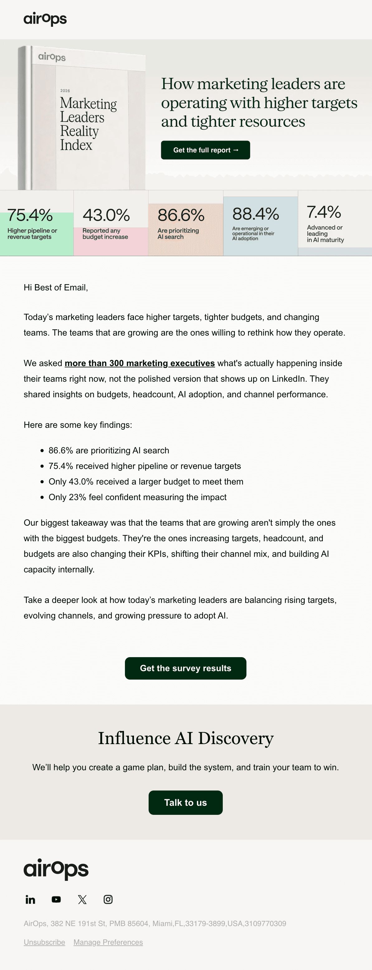
AirOps backs its "2026 Marketing Leaders Reality Index" with a five-stat strip, making the research's weight visible before the reader even clicks.
Nobody wants another vague survey recap. AirOps opens with "higher targets, tighter budgets" so the reader feels understood before the ask, then backs it with five hard stats instead of adjectives.
Why this email made the gallery
- Trust & compliance scored 100 out of 100
One-click unsubscribe built in
It carries the List-Unsubscribe and List-Unsubscribe-Post headers Gmail and Yahoo require from bulk senders, protecting inbox placement.
- Layout scored 97 out of 100
A good length for a B2B email
At 198 words it stays under the 250-word mark that reads comfortably on a phone screen.
- Layout scored 97 out of 100
Columns stack on a phone
Media queries switch side-by-side blocks to a single column on small screens, which matters since more than half of opens happen on mobile.
- CTA scored 84 out of 100
CTA text says what happens
"Get the survey results" tells readers exactly what they'll get when they click.
- Accessibility scored 79 out of 100
Readable font sizes
Body copy is set large enough to read on a phone without zooming in.
Published
87/1004/5 Best of Email
A survey stat strip that sells the research itself
AirOps backs its "2026 Marketing Leaders Reality Index" with a five-stat strip, making the research's weight visible before the reader even clicks.
Nobody wants another vague survey recap. AirOps opens with "higher targets, tighter budgets" so the reader feels understood before the ask, then backs it with five hard stats instead of adjectives.
Why this email made the gallery
- Trust & compliance scored 100 out of 100
One-click unsubscribe built in
It carries the List-Unsubscribe and List-Unsubscribe-Post headers Gmail and Yahoo require from bulk senders, protecting inbox placement.
- Layout scored 97 out of 100
A good length for a B2B email
At 198 words it stays under the 250-word mark that reads comfortably on a phone screen.
- Layout scored 97 out of 100
Columns stack on a phone
Media queries switch side-by-side blocks to a single column on small screens, which matters since more than half of opens happen on mobile.
- CTA scored 84 out of 100
CTA text says what happens
"Get the survey results" tells readers exactly what they'll get when they click.
- Accessibility scored 79 out of 100
Readable font sizes
Body copy is set large enough to read on a phone without zooming in.
Grade breakdownHow this email scored across the 12 categories. The 3 strongest are highlighted; hover or tap a category for what it measures.
Inbox
- 99 out of 100
- 96 out of 100
- 94 out of 100
- 92 out of 100
- 100 out of 100
Message
- 69 out of 100
- 84 out of 100
- 58 out of 100
- 80 out of 100
Design
- 97 out of 100
- 97 out of 100
- 79 out of 100